Sunday, June 9, 2013

How Do I Look?

Can you identify the following logos?
click on the logo to see if you're correct 
  

Having a distinct and consistent aesthetic is important for any company but essential  for larger companies/brands who have a vast portfolio of products. 

A recent Fast Company Design post, "A Rare Peek At The Guidelines That Dictate Google's Graphic Design" gives a really interesting and detailed look at how Google stepped up their game after Larry Page took over as CEO and started sweating the small stuff when it came to Google's digital aesthetic and consistency. 

Below is an example of how particular they were when looking at their new consistent look - they even specify the shadowing for icons. 

Companies, brands, even individuals would be wise to take Google's example and set umbrella guidelines for how you will appear to the world - just make sure to set this in place earlier than Google did. As marketers, your dream is to have a product that is easily recognizable. That share of mind is invaluable. If you don't have a consistent aesthetic across all your products, the customer must work harder. This is rarely a good strategy.

Some things to keep in mind...

  • You want your appearance to match your company/style/products/emotion you're trying to convey. 
  • Simple is better - limit colors, fonts to as few as possible
  • Ensure it is representative of brand and product
When you boil it down and do everything right, the customer should be able to recognize your brand from just a logo or even partial logo. We are able to intuite just from the coloring of the Google Wallet logo that it is a Google product. 

This should be the aim of everyone company. The easier it is for a customer to recognize a product, the higher the potential likelihood  that the customer may buy/consume/hire/download it.

For a deeper look into Google's design guidelines, you can find them here:


Tuesday, May 14, 2013

Hot Ham Water! Just A Smack of Ham


Does Motherboy XXX, Afternoon Delight or The Queen Mary mean anything to you?

Who do you first think about when you heard the names George, Lindsay or Buster?


If you think Arrested Development, you're in good company and we should be friends.  If it wasn't, please go to Netflix, Hulu, Best Buy or your local library and buy/rent/stream/borrow one of the best television shows in recent memory.

Netflix is about to premiere their latest Netflix-only show, a final season of Arrested Development. Fans of the show have been waiting for this season for many years, hoping that someone, anyone would pick-up the show and create new episodes. In one of the last episodes aired on Fox, the writers actually wrote into the script the characters pleading to HBO, The Home Builders Organization to save the family business.

Netflix's goal is to now spread awareness and attract non-subscribing fans of Arrested Development to their service. One really inventive way they've used digital marketing is through their partnership with Seamless web.

Netflix has partnered with seamless by inserting Bluth's Original Frozen Banana stand as a restaurant you may order delivery from. This is incredibly clever and innovative. The promotion gets even more fandom-worthy when you view the menu.

Marketers would do well to take note of this example. It's a great way to connect with customers and stir up even more fervor for an upcoming premiere.

Also, as a note... Never give up animation rights.

Sunday, May 5, 2013

Can I Just Get A Little Perspective?

In the immortal words from The Graduate, I have one word for you...Plasti... I mean... Perspective.

Perspective is THE crucial factor in any work that a marketer does. 

Perspective is what gives marketers insight and direction. Changing this perspective will give you fresh insights and ideas that you quite possibly could not have seen previously. Watch the historic video created by the designers Ray and Charles Eames, Power of Ten.

This video illustrates how changing your perspective by a power of 10, can change your entire world view. By adding or subtracting a few zeros from image, you are something completely different but also the same. You see how everything fits together - from the carbon atom to the universe it comprises. 

Is there anything that could be more apt for this blog? I don't think so. 

To be successful marketers, you want your product to fit in perfectly with the customer, make it something they need, that is not disruptive to their life but adds to it - makes it more complete. Tim Brown, CEO of IDEO, gives his insight into this method in the frame of digital apps in his recent blog post, The Power of the Power of Ten. People don't just want apps that are easy to use but that make their life easier. 

Many marketers may feel like they aim their marketing this way; What is the customer's problem we're solving? How do we do that? These are key questions you learn as marketing students to aim any campaign but without perspective you may still be totally off the mark. A cleaning product campaign may be marketed with a focus on its strength but because the marketers didn't explore deep enough down further powers of magnification, that missed that customers actually want a stronger product because they want to spend less time cleaning. Potential customers didn't see a fit with the product. This was a missed opportunity.

Marketers need to look at products from a granular level and up from a broad systems-based view. How effective is the product? What does it do? How does it fit into the life of the user? Look at the product from the perspective of 1 millimeter. 100 meters. 10000 meters. How well does the product fit into the customers life at these levels? If it appears to not fit so well at certain magnifications, it would be wise to review the product and make some changes. 

The stronger a product fits in with a customer, the more likely they are to use it and continue using it. With the right insight proper user experience, users will become evangelists. Refer back to my blog on Evernote. The proper insight and fit of this app with the user has created many evangelists. It is easy to use AND makes the users life easier. It is adaptable to a myriad of situations and uses from the very granular to galactic view. Evernote is an example of success because it is not only easy to use in isolation but it is a great fit in the systems-based perspective; the how, why and where customers use it. 

Remembering to keep focus on the customer and look at their world from several perspectives will help everyone, from the marketing student to CEO, produce the best product and marketing that best fits the customer. Peter Drucker best summed this up in his quote (and the source of this blog's title, Fitting the Customer)

"The aim of marketing is to know and understand the customer so well the product or service fits him and sells itself" - Peter Drucker


Saturday, April 27, 2013

The Age of 101: Key Points Of Digital Marketing Strategy


There are 10 types of companies in the world. Those who understand digital and those who don't.

"Being digital" is the saying-du-jour for most companies. Companies believe that being digital is WHAT they have to do but they have no idea HOW or WHY. 

Companies looking to dip their toe into the waters of the digital world (or even those who have been in for a while) need to analyze what I feel are the five key points of any digital campaign.


Audience

You have to know your audience. This is the key for any campaign but something that can be easily lost sight of when focusing on digital. Companies may think that since it costs nothing/little to be on facebook/Twitter/Instagram/Google+ and the list goes on that you should have a presence on there. You shouldn't.

Where are your customers? The customers must be the center of every campaign. If you're selling acne medication, it will not be effective to buy ads on LinkedIn. If your desired demographic is male, Pinterest would not be the place to have a page. 

You can't be everything to everyone and you can't be everywhere else you'll be seen nowhere. 


Expectations

The next crucial aspect to understand is setting the right expectations & goals for the campaign. If you don't have what you expect to achieve from the campaign set at the get-go, you will only meet disappointment. 

With digital marketing it can be even more difficult to set concrete goals and benchmarks since there is rarely a direct path from the customer to the company. You may be looking for increased orders, to build your email database, or for people to donate money; whatever your goal, set the benchmarks and measurements that you're able to capture and use.

You will use your set goals to influence every action that the company does from here on. If an action/medium doesn't fit your goal and reach your desired customer; don't do it.


Story Creation/Authenticity

Now comes problem the most difficult aspect for companies to get their heads around - content. This is where the company receives its voice and talks to its customers. You want to intrigue the customers - entice them to learn more about your product/service. 


All your communications, whether tweets, facebook updates, YouTube video or banner ads, must match the tone of your brand. It must seem authentic to the customer. No one will trust a "serious" brand that makes slap-stick commercials or sarcastic tweets. 

To the left is an example of good content creation by Irrational Games for Bioshock Infinite, "Columbia, A Modern Day Icarus?" This video hits perfectly with the demographic of the game, 25-35 year old males. It's reminiscent of the informative videos shown in science classes around the country in the 70s and 80s 


Below are a series of TED talks that give insight on storytelling and how to be a better storyteller. 

Social

If corporate heads don't say the words "We need to be digital" than a large percentage of the remaining time they will say "We need to be social." 

I want to emphasize that "being social" doesn't just mean being on a social network. You can be on facebook and twitter but if you're not engaging your followers - not being social - then you're not doing it properly. You will need to set up the campaign with more than just tweets of "Buy our product," "Sale Today," "Come to our store." You need to start conversations with your followers. Go back to the true meaning of social.

Mobility

Finally, once all the content is done and created, companies have to ensure that their customers see it. As I discussed in my previous blog post, "Call and Respons(iv)e: Responsive User Design," people are increasingly using smartphone and mobile devices as their primary devices. This means that a website that has been created for a PC/laptop may not have a similar user experience when being viewed by someone on the tablet. 

Here is an example of the Bioshock Infinite website viewed from a smartphone. The banner is un-scrollable. You're not able to scroll to the "Buy Now" or forums links on the site. 

#mobilefail

When creating websites, or any content, ensure that it is viewable from any device. You want your customers to be able to view you wherever they are. 

Keeping these five aspects in mind when creating a digital campaign will bring you a long way to ensuring it's a successful one. 

So, Remember...
Identify your audience. Identify your voice. Use it. 


Saturday, April 20, 2013

Huey Lewis and the News(jacking) : Poor Attempts At Newsjacking


*Whisper*  
Hey...
Yeah... you. 
Come here, I need to tell you something. 
No, come closer... 
It's a secret, I need to whisper it. 

DON'T NEWSJACK DURING A TRAGEDY!

Newsjacking is a term coined by David Meerman Scott that he defines as,
the process by which you inject your ideas or angles into breaking news, in real-time, in order to generate media coverage for yourself or your business.

Most companies by now know that newsjacking a tragic event, such as the Boston Marathon bombing, is off limits. Others... do not. 

Epicurious is one company who has yet to learn this lesson. Read the two tweets below. 

During a time of tragedy, it's ok to break away from your social media strategy and just express your thoughts of concern, well-wishes or ways for people to help. Do NOT shill for a scone recipe. 

They were called out for this insensitive newsjacking and tweeted these...
Those tweets sound frank and apologetic. 

They should have followed that with tweets/retweets of ways to help those who are hurt or stranded in the area. Put out a call for followers who are willing to take in marathoners. Tweet restaurants that are still open and willing to feed/charge phones/serve as meeting points for displaced friends, family, and marathoners. This would have been a great use of their feed. 

Instead... they decided to use their energy using a canned reply to people tweeting at them.

This explains how I feel about that...

Epicurious, don't feel so bad. You're not alone. Just ask Kenneth Cole how well he does with newsjacking. Here are good examples of an appropriate newsjacking of The Academy Awards, read and learn.

So... lesson learned, hopefully. Don't do it again. 

Sunday, April 14, 2013

Call and Respons(iv)e: Responsive User Design


2013 will not be known as the Year of the Snake. Nor is it a year until the 2014 World Cup in Brazil or the Winter Olympics in Sochi. It also isn't the year of my 31st birthday. Ok... it is ALL those things but more importantly according to Mashable, 2013 is...


If you’re not familiar with the term responsive design, in simple terms, it means creating websites that adapt to whichever medium it’s being viewed on.

Responsive design has come about as the usage of devices with various dimensions - smartphones and tablets have increased. You'll see that in less than two years, Smartphone usage increased from 29% to 50%. This increase in smartphones has also been accompanied by tablet sales looking to overtake PC and notebook sales

This means that companies designing websites for just the PC are going to bring a poor user experience to their customers, unless you love the  annoyance of scrolling left and right just to read a page.


 Above is the website for the video game developer Square - Enix. The website delivers a pretty dull - useful but dull - utilitarian user experience. On paper, it should be a great site. It has sections for community news, social media feeds, even a section to find concert locations where music from their games will be performed. In reality... not so much. To be fair, it does have a floating left scroll bar but that's hardly cutting-edge responsive design.

To get a real sense of how responsive a website is, you need to move from PC/laptop to phone & tablet browsing.


Now here is the same page as viewed from phone browser... sigh...

The website on the phone is identical to the browser version. You must scroll up/down/left/right to view the page in its entirety. This is a poor example of responsive design. There are no differences between browser and phone. For this to be a true responsive design, the site should have been minimized for the phone, banner head picture shrunk and made to one fewer column.

What few things the browser page had going for it have gone out the window with the mobile page. You still have the floating scroll bar with the mobile navigation but everything else remains the same. This site becomes even less useful when trying to view it from a mobile device.

It is becoming easier and easier for companies to create response sites so the fact that sites do not make it becomes that much more egregious. Companies, get with the picture!

Do you have any favorite examples of good/bad responsive design?

Sunday, April 7, 2013

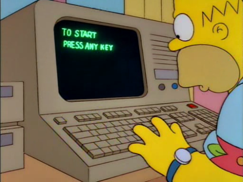
Where's The Any Key?!?

User experience has come a long way since the "dark ages" of DOS and the "any" key but there is still much progress to be made by many companies. To be successful, a company must engage customers and enable them to find what they're looking for in an easy and efficient manner.

A recent Mashable interview of Kare Anderson by Brian Solis, "Why Emotion Makes For Great Web Design" discusses the science behind a better user experience, specifically the science of emotions.  Anderson relates how understanding behavior cues in interpersonal relationships can help businesses provide a better experience between business and customer online. 

Better Listener

Anderson's talking points all boil down to the basic fact that companies (and people) need to be better listeners. 

Increased internet activity and the resulting "screen face" as she calls it are preventing people from truly connecting and being great listeners. She points to the popularity of Susan Cain's Quiet: The Power of Introverts in a World That Can't Stop Talking as a sign of people's increased feelings of introversion and isolation from others. If you read my post "Do I Fascinate You? Do I?!," you'll remember that as an INTJ this book hits close to home. 

Two cues Anderson mentions that I think are particularly true for combating this isolation and making for a better user experience is for a company to  
  • "find the sweet spot of mutual benefit"  
  • "get specific sooner." 

Mutual Benefit

A company will be unable to achieve these points unless they are actively listening to their customers. Customers will be turned off by a company if all it does is push advertisements and self-serving ads/tweets/facebook posts. Companies like Pampers and Kraft have been successful by creating content that benefits the consumer without the appearance of being self-serving. 

Customers appreciate when they feel that the company is there to help them whether it be soon-to-be or new parents looking for advice or a gamer looking for the newest game release.

Specific

The quicker a customer can find what they are looking for, the better an impression the company will make.

To the left is a screen shot from the "Games" page  at Electronic Arts

This page is a moderately successful showing of a good user experience. The page is set up so you may find games by platform, genre, release date and more, which allows you to find games by franchise, ESRB rating and type of gameplay. You are able to make a selection in each of the drop-down boxes allowing for a cross-reference and narrowing to a game that fits your criteria. 

This page also makes good use of white space, not too cluttered and features large graphics making it easy for gamers to find what they are looking for quickly by multiple methods.

Companies who master these two cues will find their customers happy and happy customers are loyal customers.